If your looking for a vintage animated typestyle that still feels current today, you've just found it!
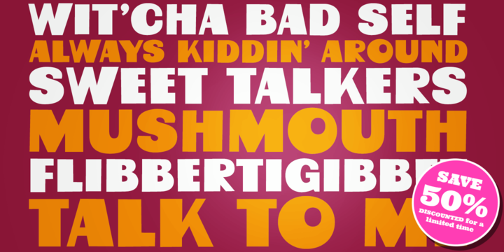
Mushmouth PB started as a digitization of a film typeface called "Albert" by LetterGraphics. This all capitals font has a super subtle bounce and a playful heavy weight. An extruded film variation of this typeface was used back in the day on Post's Frosted Rice Krinkles cereal.
Named in tribute to the original font name "Albert", we picked a fellow member of Fat Albert's gang for the name of this font. We think it is fitting, even though the original film font naming had nothing to do with the cartoon at all. Give Mushmouth a spin and pick it up today!
Download Mushmouth PB Font Family From Pink Broccoli
April 17, 2019
Download Beat Boy Font Family From PizzaDude.dk
April 16, 2019
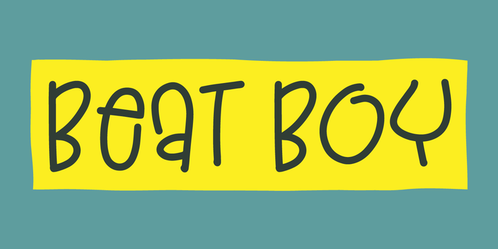
Searching for some company? Beat Boy is ready to take action - He wants to put that beat to your designs.
I am not sure which category Beat Boy fits in...is it graffiti? Comicbook text? Something for candy labels? Cute posters or hardcore skater flyers? ... the purposes of use could be many!
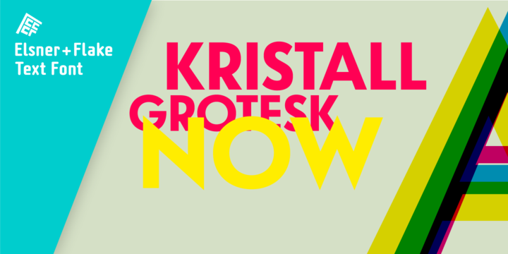
Download Kristall Now Pro Font Family From Elsner+Flake
April 16, 2019
The design of Kristall Grotesk Now is based on a cut by Wagner & Schmidt, Leipzig, from the 30s of the last century as well as the digital version Kristall Grotesk MdK, created for the Stiftung Werkstattmuseum für Druckkunst. The implementation of the Kristall Grotesk MdK, a headline font, was deliberately created as a replica to create a faithful reproduction of the original. The design of the complete family Kristall Grotesk Now is based on the one cut Kristall Grotesk Buchschrift by Johannes Wagner GmbH, 1937, with its function as a text family.
Designer: in parts Johannes Wagner GmbH, Redesign Elsner+Flake, Hamburg
Designdate: 1937, 2009
Publisher: Elsner+Flake
Design Owner: Elsner+Flake
Original Foundry: in parts Johannes Wagner GmbH
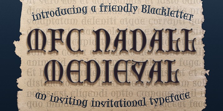
Download MFC Nadall Medieval Font Family From Monogram Fonts Co.
April 16, 2019
MFC Nadall Medieval was originally designed by Bernard William "Berne" Nadall for Barnhardt Brothers & Spindler back in 1885 under the name "Faust Text" and later under the "Missal Text Series". While you could use its capitals to construct an initial monogram, this is not a monogram font, but instead a fully functional typeface for invitations and period lettering. This lettering style has been precisely recreated and expanded on to create a full typeface with a small collection of ligatures.
Here's what's included with the MFC Nadall Medieval:
- 397 glyphs in MFC Nadall Medieval - including Capitals, Lowercase, Numerals, Punctuation and an extensive character set that covers multilingual support of latin based languages. (see the last graphics for a preview of the characters included)
- Ornaments - two ornament glyphs.
- Ligatures - for ff, fi, fl, ffi, and ffl combinations.
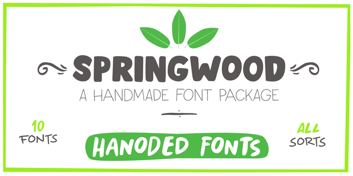
Download Springwood Font Family From Hanoded
Spring is in the air! At least, where I live. My two pear trees are in bloom, bees are buzzing and everything turns a brighter shade of green. Time for a new and fresh font package with a spring-inspired name!
Springwood is a handmade set of fonts, ranging from a fat display font to a messy script font. Use it for your freshest ideas, your coolest designs or just anything that needs a bit of springtime.
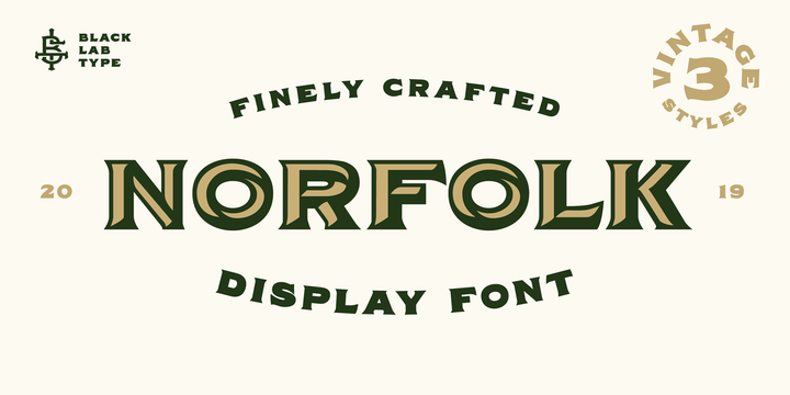
Download BLT Norfolk Font Family From Black Lab Type
April 16, 2019
Norfolk is a vintage-inspired font based on the styles found on packaging from the early 1900's. It evokes a genuine and timelessly crafted look from this period.
Three styles are included in this family: Fill, Inline and Outline. The styles can be used together or layered to create a variety of vintage looks for any project. Norfolk works well as a header or title for branding, packaging or publications.
Download Gigantic Font Family From Schizotype
April 16, 2019
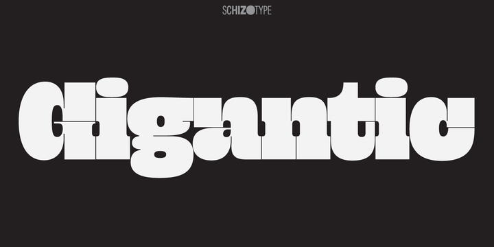
Gigantic, as the name suggests, should be set large. The type is spaced "tight-not-touching" so you really don't want to go under 72 points. The font is intended to be used to create an impact - a chunk of text will have a graphic aesthetic while maintaining legibility. Because it's so bold, it's a great face to use with images showing through. Ideal for magazine headlines and posters, not so ideal for setting novels.
Subscribe to:
Posts
(
Atom
)